New Branding To Match
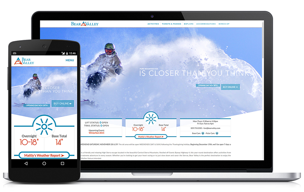
Bear Valley was overdue for a new look to go with its new online presence. I designed this logo over the course of eight drafts and iterations, in time for the launch date. We wanted a brand that was cleaner and more encompassing, without nailing the resort down to an overly narrow perception with our customers on who it would be best suited for.
A big hurdle in particular was the use of the bear itself. The old logo, and a number of the first drafts, were of a bear's face. This opened the door to a number of conflicting personifications of the bear to different people upon seeing the logo, and this was proving to be an inconsistent and unreliable vector I needed to iron out. The solution, as shown here, was to take a different approach where the bear is represented by a full body shilouette instead of a face.
Overall, the site and brand was developed in 28 days, during the month of October. It wasn't comissioned until autumn to overhaul the resort's properties and had to be ready in time for ski season. To meet this demand, I developed a lot of overlapping, coordinated development methods.


